Google is now rolling out a new design for the Gemini app on Android, making the home screen much simpler. With this redesign, users can expect a more user-friendly experience.
The earlier version had the ‘Gemini’ logo on top followed by a carousel of suggestions that users could hide, and a ‘Chats & Gems’ section, which showed the last three queries.
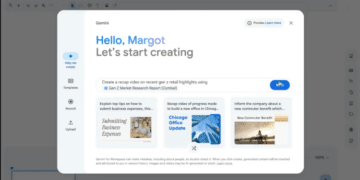
This has now been changed to a simple ‘Hi [name]’ greeting and chat bubble on the upper left corner where users can view their chat history. The web app has also been updated to show just a greeting, according to the 9to5Google.
Before, the text field had a prominent prompt saying ‘Type, talk, or share a photo to Gemini Advanced,’ along with a centered microphone and camera icon, flanked by the upload menu and Gemini Live.
Now, all these elements are condensed into one line just like a chat conversation. The ‘plus’ sign is still placed at the front, and the prompt has been changed to ‘Type, talk, or share a photo.’
The microphone and icons are perfectly within the oblong text field, and the Gemini Live waveform is positioned in the corner. There’s also an animation when you tap to expand it – this revives the old UI.

